Gnuplot data analysis: a real world example
Creating graphs in LibreOffice is a nightmare. They’re ugly, nearly impossible to customize and creating pivot tables with data is bloody tedious work. In this post, I’ll show you how I took the output of a couple of performance test scripts and turned it into reasonably pretty graphs with a few standard command line tools (gnuplot, awk, a bit of (ba)sh and a Makefile).
The Data
I ran a series of query performance tests against data sets of different sizes. The sets contain 10k, 100k, 1M, 10M, 100M and 500M documents. One of the basic constraints is that it has to be easy to add/remove sets. I don’t want to faff about with deleting columns or updating pivot tables. If I add a set to my test data, I want it automagically show up in my graphs.
The output of the test script is a simple tab separated file, and looks like this:
#Set	Iteration	QueryID	Duration
500M	1	101	10.497499465942383
500M	1	102	3.9973576068878174
500M	1	103	9.4201889038085938
500M	1	104	2.8091645240783691
500M	1	105	2.944718599319458
500M	1	106	5.1576917171478271
500M	1	107	5.7224125862121582
500M	1	108	5.7259769439697266
500M	1	109	4.7974696159362793
Each row contains the query duration (in seconds) for a single execution of a single query.
Processing the data
I don’t just want to graph random numbers. Instead, for each query in each set, I want the shortest execution time (MIN), the longest (MAX) and the average across iterations (AVG). So we’ll create a little awk script to output data in this format. In order to make life easier for gnuplot later on, we’ll create a file per dataset.
% head -n 3 output/500M.dat

#SET	QUERY	MIN	MAX	AVG	ITERATIONS
500M	200	0.071	2.699	0.952	3
500M	110	0.082	5.279	1.819	3
Here’s the source of the awk script, transform.awk. The code is quite verbose, to make it a bit easier to understand.
BEGIN {
}

{
        if($0 ~ /^[^#]/) {
                key = $1"_"$3
                first = iterations[key] > 0 ? 0 : 1
                sets[$1] = 1
                queries[$3] = 1
                totals[key] += $4
                iterations[key] += 1

                if(1 == iterations[key]) {
                        minima[key] = $4
                        maxima[key] = $4
                } else {
                        minima[key] = $4 < minima[key] ? $4 : minima[key]
                        maxima[key] = $4 > maxima[key] ? $4 : maxima[key]
                }
        }
}

END {

        for(set in sets) {
                outfile = "output/"set".dat"
                print "#SET\tQUERY\tMIN\tMAX\tAVG\tITERATIONS" > outfile
                for(query in queries) {
                        key = set"_"query
                        iterationCount = iterations[key]
                        average = totals[key] / iterationCount
                        printf("%s\t%d\t%.3f\t%.3f\t%.3f\t%d\n", set, query, minima[key], maxima[key], average, iterationCount) >> outfile

                }
        }
}
This code will read our input data, calculate MIN, MAX, AVG, number of iterations for each query and dump the contents in a tab-separated dat file with the same name as the set. Again, this is done to make life easier for gnuplot later on.
I want to see the effect of dataset size on query performance, so I want to plot averages for each set. Gnuplot makes this nice and easy, all I have to do is name my sets and tell it where to find the data. But ah … I don’t want to tell gnuplot what my sets are, because they should be determined dynamically from the available data. Enter, a wee shellscript that outputs gnuplot commands.
#!/bin/sh

# Output plot commands for all data sets in the output dir
# Usage: ./plotgenerator.sh column-number
# Example for the AVG column: ./plotgenerator.sh 5

prefix=""

echo -n "plot "
for s in `ls output | sed 's/\.dat//'` ;
do
        echo -n "$prefix \"output/$s.dat\" using 2:$1 title \"$s\""

        if [[ "$prefix" == "" ]] ; then
                prefix=", "
        fi
done
This script will generate a gnuplot “plot” command. Each datafile gets its own title (this is why we named our data files after their dataset name) and its own colour in the graph. We want to plot two columns: the QueryID, and the AVG duration. In order to make it easier to plot the MIN or MAX columns, I’m parameterizing the second column: the $1 value is the number of the AVG, MIN or MAX column.
Plotting
Gnuplot will call the plotgenerator.sh script at runtime. All that’s left to do is write a few lines of gnuplot!
Here’s the source of average.gnp
#!/usr/bin/gnuplot
reset
set terminal png enhanced size 1280,768

set xlabel "Query"
set ylabel "Duration (seconds)"
set xrange [100:]

set title "Average query duration"
set key outside
set grid

set style data points

eval(system("./plotgenerator.sh 5"))
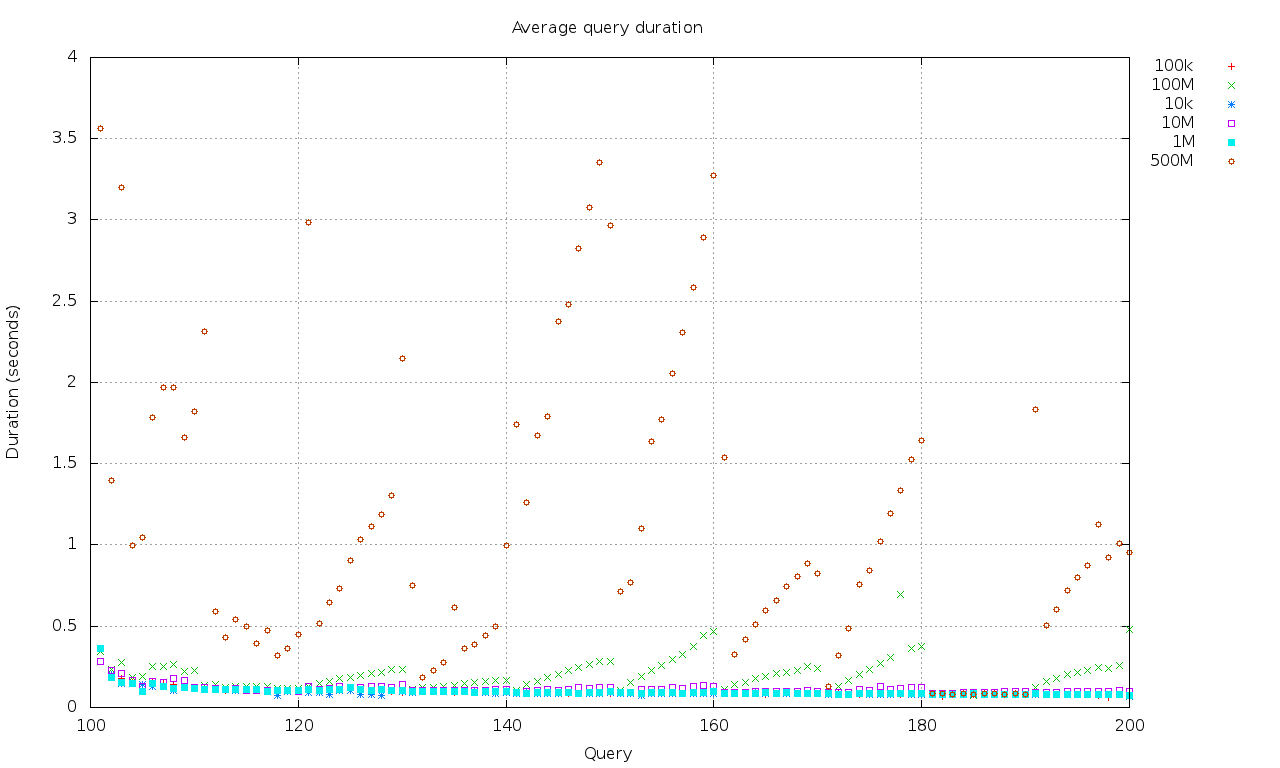
The result
% ./average.gnp > average.png
Click for full size.
Wrapping it up with a Makefile
I don’t like having to remember which steps to execute in which order, and instead of faffing about with yet another shell script, I’ll throw in another *nix favourite: a Makefile.
It looks like this:
average:
        rm -rf output
        mkdir output
        awk -f transform.awk queries.dat
        ./average.gnp > average.png
Now all you have to do, is run make whenever you’ve updated your data file, and you’ll end up with a nice’n purdy new graph. Yay!
Having a bit of command line proficiency goes a long way. It’s so much easier and faster to analyse, transform and plot data this way than it is using graphical “tools”. Not to mention that you can easily integrate this with your build system…that way, each new build can ship with up-to-date performance graphs. Just sayin'!
Note: I’m aware that a lot of this scripting could be eliminated in gnuplot 4.6, but it doesn’t ship with Fedora yet, and I couldn’t be arsed building it.
— Elric